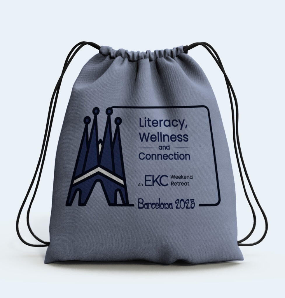
Project Overview

Client: EKC (Erin Kent Consulting)
Role: Graphic Designer
Project: Logo Design & Event Identity
The Brief: Erin Kent Consulting (EKC), an educational consulting organization, required a cohesive series of logos for their upcoming “Literacy, Wellness & Connection” weekend retreat conferences. The events were to be held in three distinct global locations: Barcelona, Bangkok, and São Paulo. The goal was to create a unified visual system that celebrated the unique spirit of each host city while maintaining a strong connection to the overarching EKC brand.
The Challenge
The primary design challenge was balancing individuality with unity. Each city needed its own distinct visual representation, but the three logos had to look undeniably like part of the same event series. Furthermore, the design needed to incorporate a significant amount of text—the conference title, the EKC branding, the city name, and the year—without feeling cluttered.
Ideation & Concept Exploration
To find the perfect balance between global scale and educational focus, I developed five distinct conceptual directions during the sketching phase:
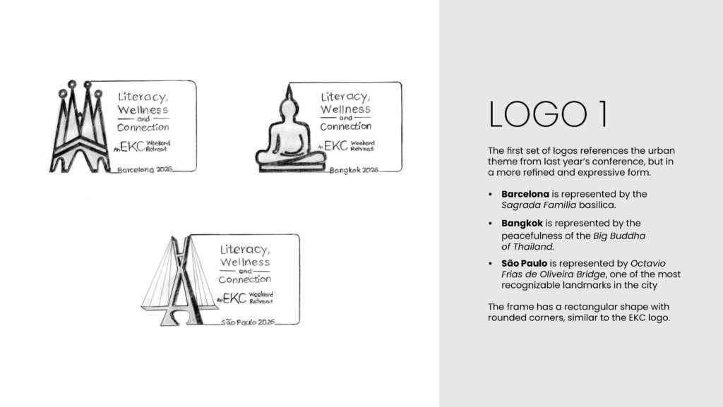
Architectural Landmarks: Referencing the urban theme of the previous year’s conference, this concept used iconic local structures (Sagrada Familia, a Buddha statue, and the Octavio Frias de Oliveira Bridge) integrated into a rectangular frame mirroring the EKC logo.
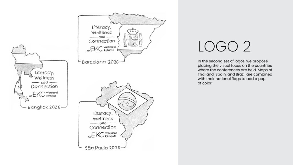
Geographical Focus: Combining national maps (Spain, Thailand, Brazil) with their respective flags to add a bold pop of color and geographic grounding.
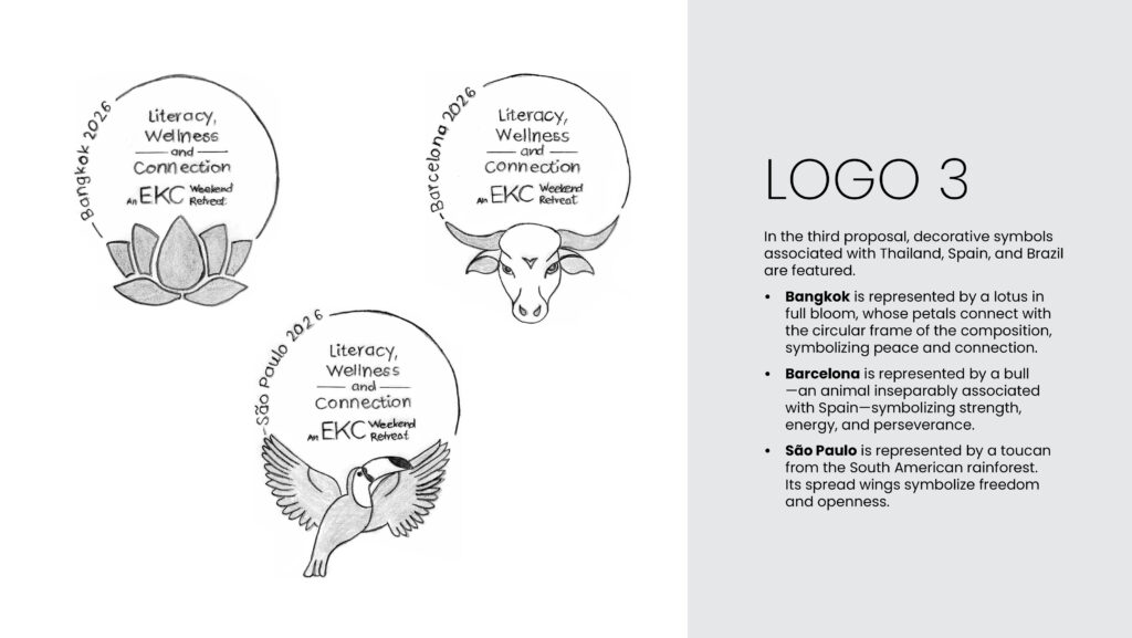
Cultural Flora & Fauna: Utilizing highly recognizable natural symbols for each location—a blooming lotus for Bangkok, a powerful bull for Barcelona, and a vibrant toucan for São Paulo.
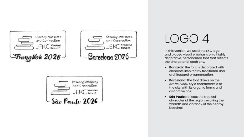
Typographic Expression: Leaning heavily on custom, decorative typography tailored to the artistic heritage of each city (e.g., Art Nouveau for Barcelona, traditional architectural ornamentation for Bangkok).
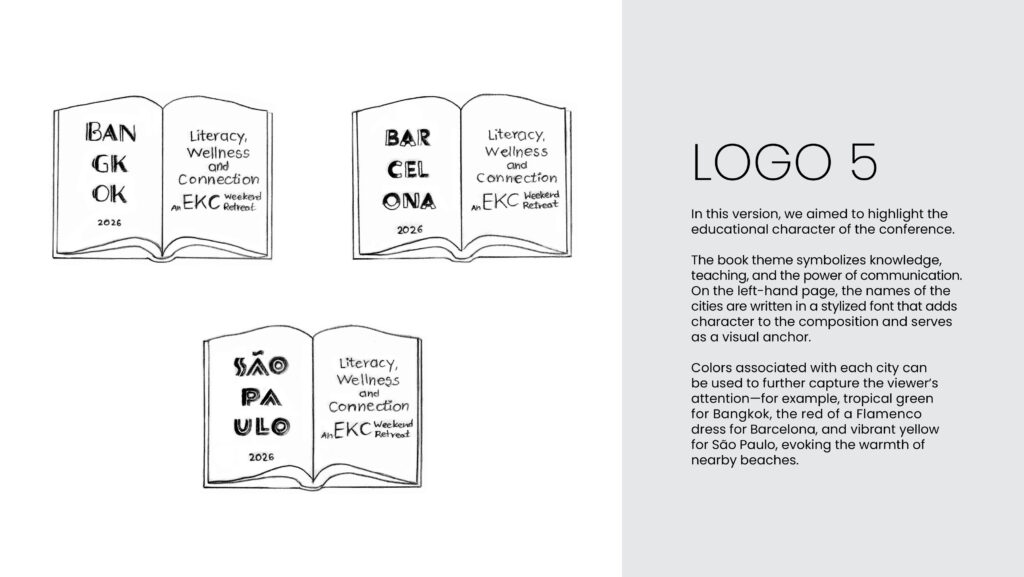
The Educational Anchor: A literal interpretation of literacy and teaching, using an open book as the core graphic, with the city names stylized on the left page.
The Solution: Refined Landmarks
After reviewing the sketches with the client, we moved forward with Concept 1: Architectural Landmarks, as it provided the strongest visual impact and most effectively balanced the urban nature of the host cities with the professional tone of the conference.
Design Development
- Visual Consistency: To ensure the three logos felt like a family, I established a strict geometric illustration style. I utilized bold, uniform line weights and a cohesive two-tone color palette derived from EKC’s primary brand colors.
- Landmark Refinement: Moving from sketch to vector, the landmarks were stylized for modern clarity.
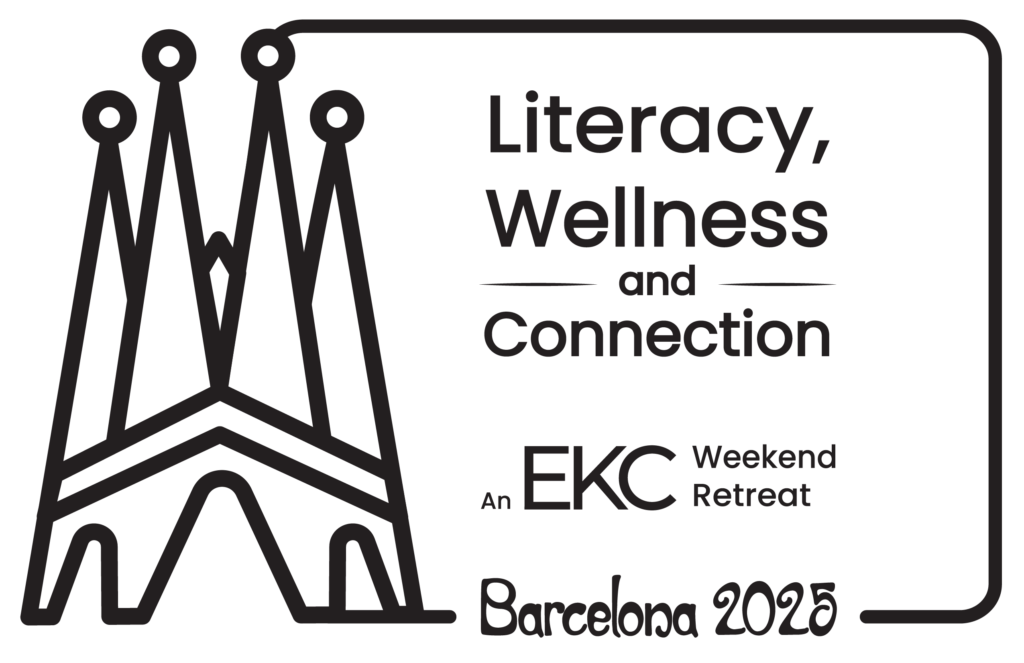
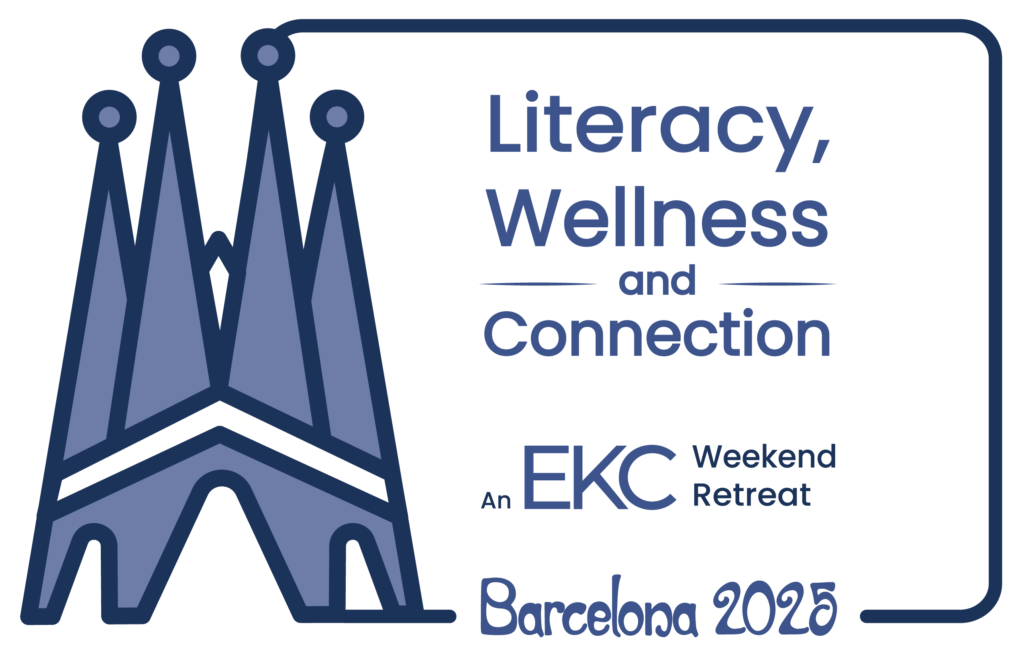
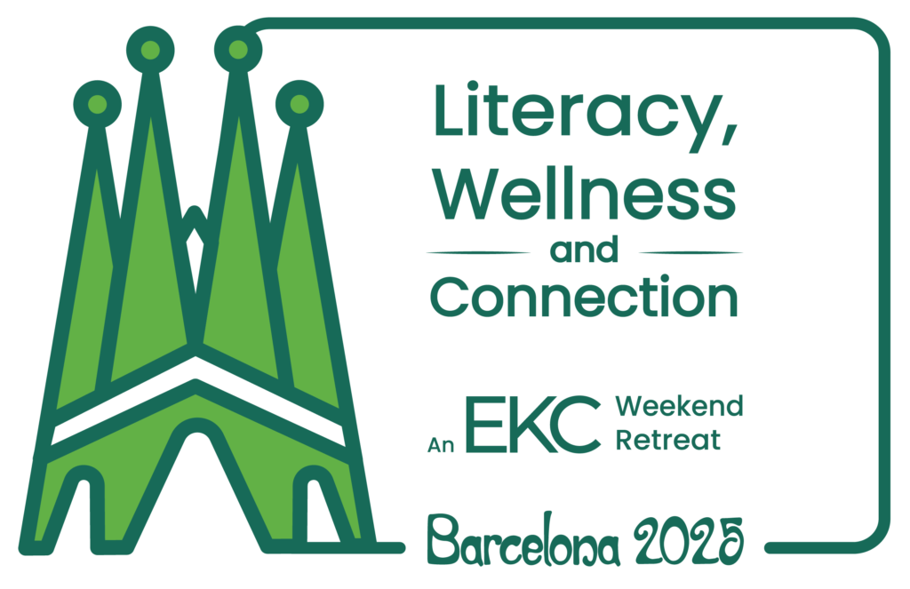
- Barcelona: The soaring, intricate spires of the Sagrada Familia were distilled into clean, overlapping geometric peaks.
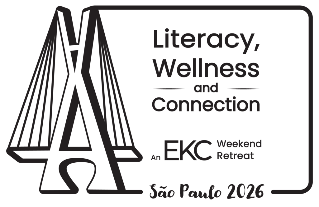
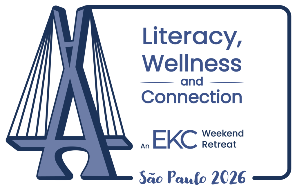
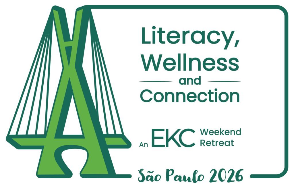
- São Paulo: The iconic Octavio Frias de Oliveira Bridge was rendered to highlight its dynamic angles and suspension cables.
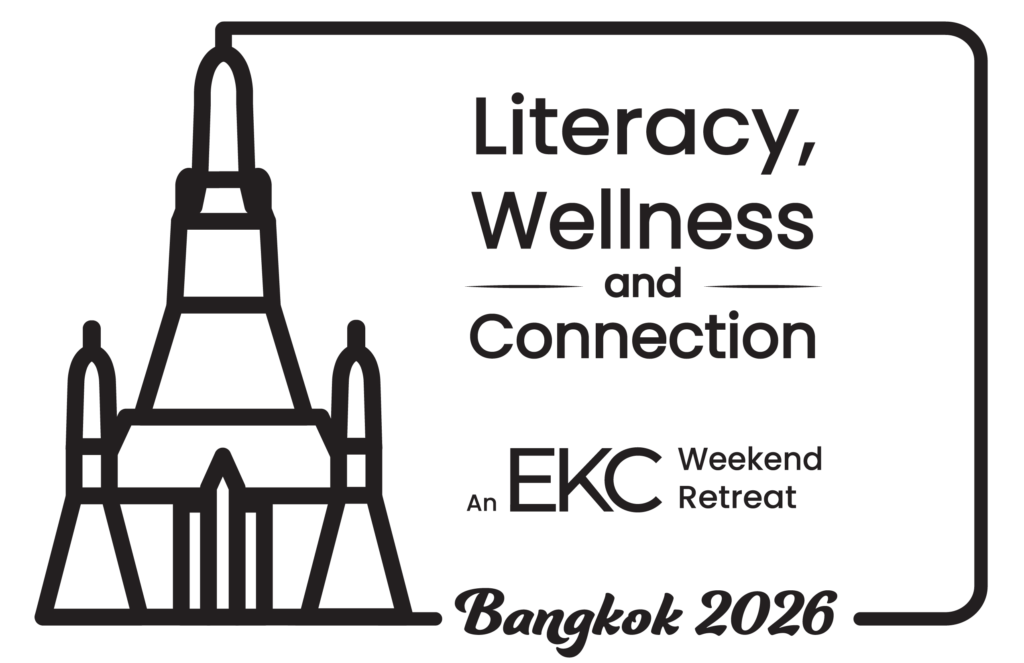
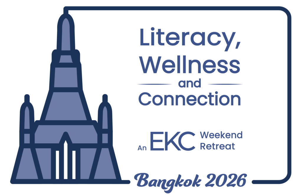
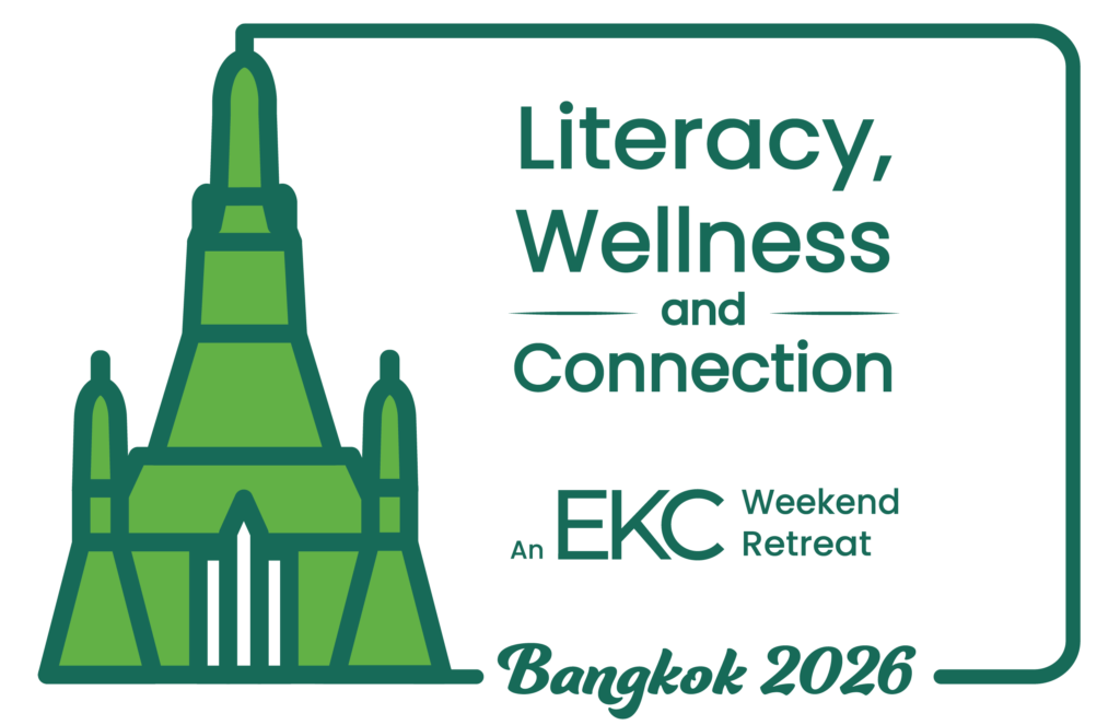
- Bangkok: The initial Buddha sketch was pivoted to the stunning architectural silhouette of Wat Arun, bringing it closer in style to the structural nature of the other two logos.
- Layout & Typography: The layout uses an asymmetrical balance. The bold landmark acts as a visual anchor on the left, breaking out of a rounded rectangular frame. The right side contains the conference details, utilizing a clean, modern sans-serif typeface for readability, paired with a customized, fluid script for the city names to inject a sense of warmth and localized energy.
Color Variations & Brand Alignment
To ensure maximum versatility across all marketing materials, conference collateral, and merchandise, the client requested additional color variation of the finalized logos aligning with EKC’s established brand colors, as well as black-and-white versions for each city’s logo. This crucial step guarantees that the designs remain striking, legible, and functional in any application—from printed handouts and sponsor packets to single-color apparel—giving the EKC team a fully adaptable branding kit for their global retreats.
The Impact
The final deliverable is a versatile, striking trio of logos that capture the excitement of global travel and the professionalism of EKC’s educational mission. The consistent framing, monochromatic palette, and unified line-art style ensure that whether viewed individually on a localized flyer or together on the main conference website, the identity remains undeniably cohesive.